


Southern Cross Living rebrand.
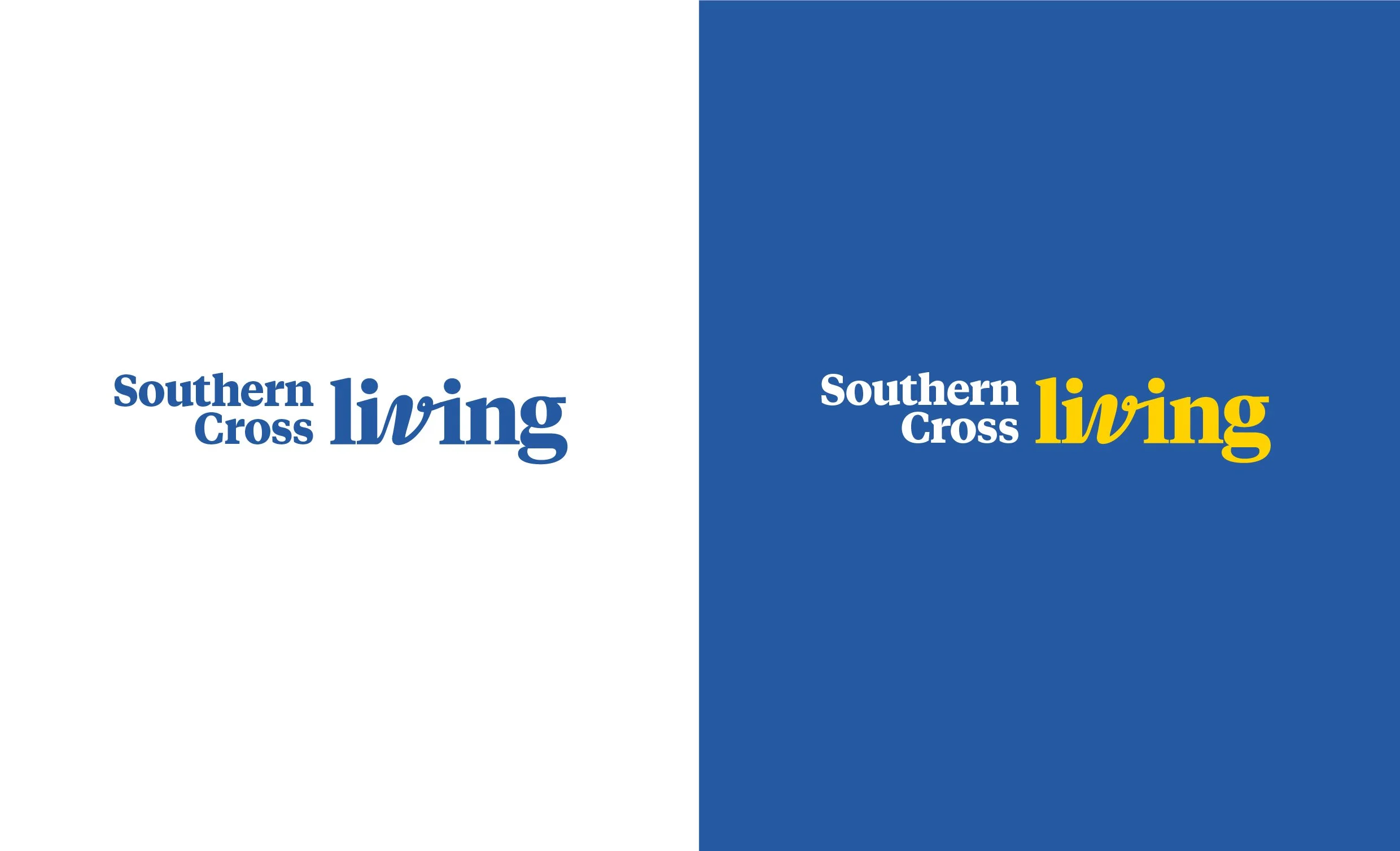
The organic form of the ‘v’ conveys a sense of human connection. The cursive, handwritten ‘v’ organic form is clearly the result of human action, adding a relatable, organic element that reminds the viewer that people are behind the brand.
The use of a vibrant yellow as the primary colour for the word ‘living’ imparts joy and optimism.